Introduction
GPUI is a fast, productive, and versatile GPU-accelerated UI framework for Rust, with a hybrid immediate and retained mode rendering API, it is designed to support a wide variety of applications. It is what notably powers the Zed editor.
This book will teach you the concepts you need to create your own GPUI application.
The chapters in this book are roughly ordered in ascending difficulty, the sections in each chapter also follow this order.
Getting Started
In this chapter, you will learn how to get started with a basic GPUI application either by using Create GPUI App or manually getting started with your own Rust project.
Versions of GPUI are periodically published to the crates.io registered crate.
Using GPUI can be done with either the crates.io crate or with a git dependency in your Cargo.toml, the GPUI crate is kept in the Zed repository as it is constantly evolving with the needs of Zed.
gpui = { version = "*" } # Specify a specific version
# OR
gpui = { git = "https://github.com/zed-industries/zed" }
Create GPUI App
Create GPUI App is a official CLI tool that lets you quickly setup and get started with a GPUI application.
Build and Install
cargo install create-gpui-app
Usage
Monolithic Structure
create-gpui-app --name my-app
cd my-app
my-app
├── src
│   └── main.rs
├── Cargo.toml
└── README.md
Workspace Structure
create-gpui-app --workspace --name my-app
cd my-app
my-app
├── Cargo.toml
├── crates
│   └── my-app
│       ├── Cargo.toml
│       └── src
│           └── main.rs
└── README.md
Manual Project
This section will walkthrough how to manually setup a monolithic project structure for your GPUI application without the use of the create-gpui-app CLI tool.
Setup
cargo new my-app
cd my-app
You may either add gpui using the crates.io crate or git repository.
Adding gpui using a crates.io dependency to the Cargo.toml.
cargo add gpui
Adding gpui using a git dependency to the Cargo.toml.
cargo add gpui --git https://github.com/zed-industries/zed
Hello World Example
Add the basic Hello World example code to the main.rs.
use gpui::{
    AppContext, Application, Context, IntoElement, ParentElement, Render, SharedString, Styled,
    Window, WindowOptions, div, white,
};

struct HelloWorld {
    text: SharedString,
}

impl Render for HelloWorld {
    fn render(&mut self, _window: &mut Window, _cx: &mut Context<Self>) -> impl IntoElement {
        div()
            .size_full()
            .bg(white())
            .flex()
            .justify_center()
            .items_center()
            .text_3xl()
            .child(format!("Hello, {}!", &self.text))
    }
}

fn main() {
    Application::new().run(|app| {
        app.open_window(WindowOptions::default(), |_window, app| {
            app.new(|_cx| HelloWorld {
                text: SharedString::new_static("World"),
            })
        })
        .unwrap();
    });
}
Architecture
In this chapter, you will learn the architecture of GPUI.
Application
The Application is the entry point into your GPUI application.
Creating an Application
The new function creates the Application.
use gpui::Application;

fn main() {
    let application = Application::new();
}
Running an Application
The run function consumes the Application and takes a callback which will be fired once the application has finished loading. This callback is the entry point into your application, a mutable reference of App is supplied where you can start controlling aspects of your application like opening a window.
use gpui::Application;

fn main() {
    let application = Application::new();

    application.run(|_app| {
        // Entry point
    });
}
App
App contains the state of your whole application, it allows you to control many aspects of the application's functionality such as managing the state of Entity's.
Opening a Window
Using App you can access the open_window function which takes a WindowOptions and a callback which supplies mutable references to a Window and App that is used to build the root view. To learn more on how views are created, you can read the Render section.
use gpui::{Application, WindowOptions};

fn main() {
    Application::new().run(|app| {
        app.open_window(WindowOptions::default(), |window, app| {
            // Return root view
        })
        .unwrap();
    });
}
On Action
Using App you can use on_action function to bind a callback to the firing of a action globally throughout your application.
use gpui::{
    AppContext, Application, Context, Empty, IntoElement, Render, Window, WindowOptions, actions,
};

actions!(actions_namespace, [Enter]);

struct RootView;

impl Render for RootView {
    fn render(&mut self, _window: &mut Window, _cx: &mut Context<Self>) -> impl IntoElement {
        Empty
    }
}

fn main() {
    Application::new().run(|app| {
        app.open_window(WindowOptions::default(), |_window, app| {
            app.bind_keys([gpui::KeyBinding::new("enter", Enter, None)]);
            app.on_action(|&Enter, _app| println!("Enter key hit!"));

            app.new(|_cx| RootView)
        })
        .unwrap();
    });
}
Spawn
Using App you can use the spawn function to enqueue a future on the main thread, it takes a AsyncFnOnce which will provide AsyncApp when the async closure is invoked. The AsyncApp allows you to access application state.
use gpui::Application;

fn main() {
    Application::new().run(|app| {
        app.spawn(async |app| {
            // Some asynchronous work
        })
        .detach();
    });
}
Window
Window represents a platform window, it allows you to control many aspects of the window's functionality.
Bounds
Gives the origin and size of the platform window.
use gpui::{AppContext, Application, Context, Empty, IntoElement, Render, Window, WindowOptions};

struct RootView;

impl Render for RootView {
    fn render(&mut self, _window: &mut Window, _cx: &mut Context<Self>) -> impl IntoElement {
        Empty
    }
}

fn main() {
    Application::new().run(|app| {
        app.open_window(WindowOptions::default(), |window, app| {
            println!("{:?}", window.bounds());

            app.new(|_cx| RootView)
        })
        .unwrap();
    });
}
Mouse Position
Gives the x and y position of the mouse relative to the window.
use gpui::{AppContext, Application, Context, Empty, IntoElement, Render, Window, WindowOptions};

struct RootView;

impl Render for RootView {
    fn render(&mut self, _window: &mut Window, _cx: &mut Context<Self>) -> impl IntoElement {
        Empty
    }
}

fn main() {
    Application::new().run(|app| {
        app.open_window(WindowOptions::default(), |window, app| {
            println!("{:?}", window.mouse_position());

            app.new(|_cx| RootView)
        })
        .unwrap();
    });
}
Context
Context dereferences to App so it has all the functionality available to App and it also has additional functionality for controlling the Entity it belongs to.
Notify
The notify function alerts GPUI that the Entity has been updated and that observers of it should be notified. If the T type of Context<T> implements Render then the view will be re-rendered.
use gpui::{AppContext, Application};

pub struct SomeState {
    some_value: bool,
}

fn main() {
    Application::new().run(|app| {
        let entity = app.new(|_cx| SomeState { some_value: true });

        entity.update(app, |this, cx| {
            this.some_value = false;

            cx.notify();
        });
    });
}
State Management
In this chapter, you will learn how to manage state in your GPUI application.
There are two main ways of storing application state.
Entity
Entity<T>'s are used when you need to store application state that must communicate between different parts of your application. They are owned by GPUI and can be managed with any type that implements the AppContext trait, App and Context<T> are two common types seen in GPUI which implement AppContext. All entities are owned inside of App and all other types that implement AppContext dereference to App to access the entities.
There are some other types that also implement AppContext that are used in more advanced cases relating to async GPUI.
If the T type of a Entity<T> implements the Render trait it is commonly referred to as a view.
Creating a Entity
This will create a Entity with the given state.
use gpui::{AppContext, Application};

pub struct SomeState {
    some_value: bool,
}

fn main() {
    Application::new().run(|app| {
        let entity = app.new(|_cx| SomeState { some_value: true });
    });
}
Reading a Entity
This will give you a reference to the state.
use gpui::{AppContext, Application};

pub struct SomeState {
    some_value: bool,
}

fn main() {
    Application::new().run(|app| {
        let entity = app.new(|_cx| SomeState { some_value: true });

        let some_state = entity.read(app);
    });
}
Updating a Entity
This will update the state.
use gpui::{AppContext, Application};

pub struct SomeState {
    some_value: bool,
}

fn main() {
    Application::new().run(|app| {
        let entity = app.new(|_cx| SomeState { some_value: true });

        entity.update(app, |some_state, _cx| {
            some_state.some_value = false;
        });
    });
}
Downgrading a Entity
This will turn a Entity into a WeakEntity which is a weak pointer.
use gpui::{AppContext, Application};

pub struct SomeState {
    some_value: bool,
}

fn main() {
    Application::new().run(|app| {
        let entity = app.new(|_cx| SomeState { some_value: true });

        let weak_entity = entity.downgrade();
    });
}
Global
Global's are used when you need to share some state with your whole application. A common example of a global state is the application's settings. Any type that implements the Global marker trait can be stored as a global, similar to Entity they are owned by GPUI.
Marking a type as a Global
Before you can set some type as a global it must implement the Global marker trait.
use gpui::Global;

pub struct SomeState {
    some_value: bool,
}

// Global marker trait
impl Global for SomeState {}
Setting a Global
This will set the global for the given type. The type must implement Global.
use gpui::{Application, Global, UpdateGlobal};

pub struct SomeState {
    some_value: bool,
}

impl Global for SomeState {}

fn main() {
    Application::new().run(|app| {
        app.set_global::<SomeState>(SomeState { some_value: true });

        // OR

        SomeState::set_global(app, SomeState { some_value: true });
    });
}
Accessing a Global
This will give you a reference to the global. Accessing a global that has not been set will cause a panic.
use gpui::{Application, Global, ReadGlobal};

pub struct SomeState {
    some_value: bool,
}

impl Global for SomeState {}

fn main() {
    Application::new().run(|app| {
        app.set_global::<SomeState>(SomeState { some_value: true });

        let some_state = app.global::<SomeState>();

        // OR

        let some_state = SomeState::global(app);
    });
}
Mutably Accessing a Global
This will give you a mutable reference to the global. Accessing a global that has not been set will cause a panic.
use gpui::{Application, Global};

pub struct SomeState {
    some_value: bool,
}

impl Global for SomeState {}

fn main() {
    Application::new().run(|app| {
        app.set_global::<SomeState>(SomeState { some_value: true });

        let some_state = app.global_mut::<SomeState>();
        some_state.some_value = false;
    });
}
Attempt to access a Global
This will give you a reference to the global wrapped in a Option<T>.
use gpui::{Application, Global};

pub struct SomeState {
    some_value: bool,
}

impl Global for SomeState {}

fn main() {
    Application::new().run(|app| {
        app.set_global::<SomeState>(SomeState { some_value: true });

        let some_state = app.try_global::<SomeState>();
    });
}
Check whether a Global has been set
This will check if the global has been set for the given type.
use gpui::{Application, Global};

pub struct SomeState {
    some_value: bool,
}

impl Global for SomeState {}

fn main() {
    Application::new().run(|app| {
        app.set_global::<SomeState>(SomeState { some_value: true });

        let is_set_bool = app.has_global::<SomeState>();
    });
}
Removing a Global
This will remove the global for the given type.
use gpui::{Application, Global};

pub struct SomeState {
    some_value: bool,
}

impl Global for SomeState {}

fn main() {
    Application::new().run(|app| {
        app.set_global::<SomeState>(SomeState { some_value: true });

        app.remove_global::<SomeState>();
    });
}
Mutably Accessing a Global with Default fallback
This will give you a mutable reference to the global. If the global has not already been set it wil set it to the default given by the type's Default trait implementation.
use gpui::{Application, Global};

#[derive(Default)]
pub struct SomeState {
    some_value: bool,
}

impl Global for SomeState {}

fn main() {
    Application::new().run(|app| {
        app.set_global::<SomeState>(SomeState { some_value: true });

        app.default_global::<SomeState>();
    });
}
Updating a Global
This will update the global for the given type.
use gpui::{Application, BorrowAppContext, Global, UpdateGlobal};

pub struct SomeState {
    some_value: bool,
}

impl Global for SomeState {}

fn main() {
    Application::new().run(|app| {
        app.set_global::<SomeState>(SomeState { some_value: true });

        app.update_global::<SomeState, _>(|some_state, _app| {
            some_state.some_value = false;
        });

        // OR

        SomeState::update_global(app, |some_state, _app| {
            some_state.some_value = false;
        });
    });
}
Observing a Global
This will register a callback that will be called when the global is updated.
use gpui::{Application, Global};

pub struct SomeState {
    some_value: bool,
}

impl Global for SomeState {}

fn main() {
    Application::new().run(|app| {
        app.set_global::<SomeState>(SomeState { some_value: true });

        let subscription = app.observe_global::<SomeState>(|_app| {
            // Global update callback
        });

        // OR

        app.observe_global::<SomeState>(|_app| {
            // Global update callback
        })
        .detach();
    });
}
Elements
In this chapter, you will learn the various primitive elements available to you in GPUI.
To learn how to create your own elements, read the Implementing Element chapter.
Div
The Div element is the most commonly used element in GPUI. It functions as a container for other elements and can be styled and enhanced with interactivity to build a wide range of components. To learn how to style and make your element interactive go to the respective chapters Styling and Interactivity.
Creating a Div
use gpui::{AppContext, Application, Context, IntoElement, Render, Window, WindowOptions, div};

struct RootView;

impl Render for RootView {
    fn render(&mut self, _window: &mut Window, _cx: &mut Context<Self>) -> impl IntoElement {
        div()
    }
}

fn main() {
    Application::new().run(|app| {
        app.open_window(WindowOptions::default(), |_window, app| {
            app.new(|_cx| RootView)
        })
        .unwrap();
    });
}
Adding a child to a Div
use gpui::{
    AppContext, Application, Context, IntoElement, ParentElement, Render, Window, WindowOptions,
    div,
};

struct RootView;

impl Render for RootView {
    fn render(&mut self, _window: &mut Window, _cx: &mut Context<Self>) -> impl IntoElement {
        div().child(div())
    }
}

fn main() {
    Application::new().run(|app| {
        app.open_window(WindowOptions::default(), |_window, app| {
            app.new(|_cx| RootView)
        })
        .unwrap();
    });
}
Adding children to a Div
use gpui::{
    AppContext, Application, Context, IntoElement, ParentElement, Render, Window, WindowOptions,
    div,
};

struct RootView;

impl Render for RootView {
    fn render(&mut self, _window: &mut Window, _cx: &mut Context<Self>) -> impl IntoElement {
        div().children([div(), div()])
    }
}

fn main() {
    Application::new().run(|app| {
        app.open_window(WindowOptions::default(), |_window, app| {
            app.new(|_cx| RootView)
        })
        .unwrap();
    });
}
Text
There are multiple different types in GPUI that allow you to render text, to learn how to style text read the styling text chapter.
&'static str
use gpui::{
    AppContext, Application, Context, IntoElement, ParentElement, Render, Styled, Window,
    WindowOptions, div, rgb,
};

struct RootView;

impl Render for RootView {
    fn render(&mut self, _window: &mut Window, _cx: &mut Context<Self>) -> impl IntoElement {
        div()
            .size_full()
            .bg(rgb(0xFFFFFF))
            .flex()
            .justify_center()
            .items_center()
            .text_3xl()
            .child("Hello")
    }
}

fn main() {
    Application::new().run(|app| {
        app.open_window(WindowOptions::default(), |_window, app| {
            app.new(|_cx| RootView)
        })
        .unwrap();
    });
}
String
Using a String should be used sparingly as it will cause a heap allocation on every re-render, read on about SharedString to learn how to avoid this.
use gpui::{
    AppContext, Application, Context, IntoElement, ParentElement, Render, Styled, Window,
    WindowOptions, div, rgb,
};

struct RootView;

impl Render for RootView {
    fn render(&mut self, _window: &mut Window, _cx: &mut Context<Self>) -> impl IntoElement {
        div()
            .size_full()
            .bg(rgb(0xFFFFFF))
            .flex()
            .justify_center()
            .items_center()
            .text_3xl()
            .child(String::from("Hello"))
    }
}

fn main() {
    Application::new().run(|app| {
        app.open_window(WindowOptions::default(), |_window, app| {
            app.new(|_cx| RootView)
        })
        .unwrap();
    });
}
SharedString
SharedString is an immutable string that can be cheaply cloned, this is especially useful in the render function as it avoids a heap allocation on every re-render which occurs when using String.
The SharedString is typically stored in the Entity state where it can be accessed by the render function.
use gpui::{
    AppContext, Application, Context, IntoElement, ParentElement, Render, SharedString, Styled,
    Window, WindowOptions, div, rgb,
};

struct RootView {
    text: SharedString,
}

impl Render for RootView {
    fn render(&mut self, _window: &mut Window, _cx: &mut Context<Self>) -> impl IntoElement {
        div()
            .size_full()
            .bg(rgb(0xFFFFFF))
            .flex()
            .justify_center()
            .items_center()
            .text_3xl()
            .child(self.text.clone())
    }
}

fn main() {
    Application::new().run(|app| {
        app.open_window(WindowOptions::default(), |_window, app| {
            app.new(|_cx| RootView {
                text: SharedString::new_static("Hello"),
            })
        })
        .unwrap();
    });
}
StyledText
The StyledText component allows you style specific ranges of the text differently, the text ranges are called TextRun's. It is unnecessary to use StyleText if the whole range of your text uses the same style.
use gpui::{
    AppContext, Application, Context, Font, FontFeatures, FontStyle, FontWeight, IntoElement,
    ParentElement, Render, SharedString, StrikethroughStyle, Styled, StyledText, TextRun,
    UnderlineStyle, Window, WindowOptions, div, hsla, px, rgb,
};

struct RootView;

impl Render for RootView {
    fn render(&mut self, _window: &mut Window, _cx: &mut Context<Self>) -> impl IntoElement {
        div()
            .size_full()
            .bg(rgb(0xFFFFFF))
            .flex()
            .justify_center()
            .items_center()
            .text_3xl()
            .child(StyledText::new("Text").with_runs(vec![
                TextRun {
                    len: 2,
                    font: Font {
                        family: SharedString::new_static(".SystemUIFont"),
                        features: FontFeatures::default(),
                        fallbacks: None,
                        weight: FontWeight::default(),
                        style: FontStyle::default(),
                    },
                    color: hsla(0., 1., 0.5, 1.),
                    background_color: None,
                    underline: None,
                    strikethrough: Some(StrikethroughStyle {
                        thickness: px(1.),
                        color: Some(hsla(0., 1., 0.5, 1.)),
                    }),
                },
                TextRun {
                    len: 3,
                    font: Font {
                        family: SharedString::new_static(".SystemUIFont"),
                        features: FontFeatures::default(),
                        fallbacks: None,
                        weight: FontWeight::default(),
                        style: FontStyle::default(),
                    },
                    color: hsla(240. / 360., 1., 0.5, 1.),
                    background_color: None,
                    underline: Some(UnderlineStyle {
                        thickness: px(1.),
                        color: Some(hsla(240. / 360., 1., 0.5, 1.)),
                        wavy: true,
                    }),
                    strikethrough: None,
                },
            ]))
    }
}

fn main() {
    Application::new().run(|app| {
        app.open_window(WindowOptions::default(), |_window, app| {
            app.new(|_cx| RootView)
        })
        .unwrap();
    });
}
InteractiveText
The InteractiveText component allows you to make specific ranges of the text interactive, it allows you to add click and hover listeners for specific text ranges. The component takes a ElementId that must be identical on every frame and a StyledText.
use gpui::{
    AppContext, Application, Context, InteractiveText, IntoElement, ParentElement, Render, Styled,
    StyledText, Window, WindowOptions, div, rgb,
};

struct RootView;

impl Render for RootView {
    fn render(&mut self, _window: &mut Window, _cx: &mut Context<Self>) -> impl IntoElement {
        div()
            .size_full()
            .bg(rgb(0xFFFFFF))
            .flex()
            .justify_center()
            .items_center()
            .text_3xl()
            .child(
                InteractiveText::new("interactive_text_id", StyledText::new("Text")).on_click(
                    vec![1..3],
                    |_range_index, _window, _app| {
                        println!("Clicked");
                    },
                ),
            )
    }
}

fn main() {
    Application::new().run(|app| {
        app.open_window(WindowOptions::default(), |_window, app| {
            app.new(|_cx| RootView)
        })
        .unwrap();
    });
}
Img
The img element allows you to render an image, it takes a Into<ImageSource>. To learn how to style a image go to the styling image chapter.
Creating a Img
This example uses a file system path as the image, but you may use any other ImageSource instead. The CARGO_MANIFEST_DIR environment variable is used here to easily access the image.png in the project root folder as a example.
use std::path::Path;

use gpui::{
    AppContext, Application, Context, IntoElement, ParentElement, Render, Styled, Window,
    WindowOptions, div, img,
};

struct RootView;

impl Render for RootView {
    fn render(&mut self, _window: &mut Window, _cx: &mut Context<Self>) -> impl IntoElement {
        div()
            .size_full()
            .child(img(Path::new(env!("CARGO_MANIFEST_DIR")).join("image.png")).size_full())
    }
}

fn main() {
    Application::new().run(|app| {
        app.open_window(WindowOptions::default(), |_window, app| {
            app.new(|_cx| RootView)
        })
        .unwrap();
    });
}
Deferred
The Deferred element allow you to defer the layout and paint of a element. GPUI follows the Painter's algorithm where elements that get painted after will be drawn on top of a element that got painted earlier. This is where the Deferred element allows you to delay the layout and paint of its child.
Creating a Deferred
The deferred function takes a impl IntoElement which is the child element and returns the Deferred element.
use gpui::{
    AppContext, Application, Context, IntoElement, ParentElement, Render, Window, WindowOptions,
    deferred, div,
};

struct RootView;

impl Render for RootView {
    fn render(&mut self, _window: &mut Window, _cx: &mut Context<Self>) -> impl IntoElement {
        div().child(deferred(div()))
    }
}

fn main() {
    Application::new().run(|app| {
        app.open_window(WindowOptions::default(), |_window, app| {
            app.new(|_cx| RootView)
        })
        .unwrap();
    });
}
Deferred with Priority
This sets the priority at which the element will be deferred at, controlling the order relative to other deferred elements. Higher priority values are drawn on top of lower priority values.
use gpui::{
    AppContext, Application, Context, IntoElement, ParentElement, Render, Window, WindowOptions,
    deferred, div,
};

struct RootView;

impl Render for RootView {
    fn render(&mut self, _window: &mut Window, _cx: &mut Context<Self>) -> impl IntoElement {
        div().child(deferred(div()).with_priority(10))
    }
}

fn main() {
    Application::new().run(|app| {
        app.open_window(WindowOptions::default(), |_window, app| {
            app.new(|_cx| RootView)
        })
        .unwrap();
    });
}
Styling
In this chapter, you will learn how to style elements in your GPUI application.
GPUI uses Taffy as the underlying layout engine, it powers how elements are laid out.
The styling of elements can be done using the utility CSS-like styling API or by modifying the underlying Style struct of the element, this can be done with .style() function which is available to any element that implements the Styled trait. The utility CSS-like styling API are just shorthand functions that allow you to apply the same underlying style adjustments in a more concise manner.
Comparison
This compares the concise nature of the utility CSS-like styling functions against the verbose method of modifying the underlying Style struct, while both still achieve the same resulting style. It is your choice if you would like to use the shorthand functions or you can even create your own custom shorthand functions.
Utility CSS-like styling API
impl Render for SomeView {
    fn render(&mut self, _window: &mut Window, _cx: &mut Context<Self>) -> impl IntoElement {
        div().flex().flex_col().child("Hello").child("World")
    }
}
Modifying underlying element Style struct
impl Render for SomeView {
    fn render(&mut self, _window: &mut Window, _cx: &mut Context<Self>) -> impl IntoElement {
        let mut element = div().child("Hello").child("World");

        let style = element.style();
        style.display = Some(Display::Flex);
        style.flex_direction = Some(FlexDirection::Column);

        element
    }
}
Element
Any element that implements the Styled trait allows its styles to be modified through the .style() function or with the utility CSS-like styling functions.
Align Content
The align_content style controls how content contained in this element should be aligned. The AlignContent enum contains Start, End, FlexStart, FlexEnd, Center, Stretch, SpaceBetween, SpaceEvenly, and SpaceAround.
Align Items
The align_items style controls how the children of the element should be aligned. The AlignItems enum contains Start, End, FlexStart, FlexEnd, Center, Baseline, Stretch.
Align Self
The align_self style controls how the element should be aligned. The AlignSelf enum contains Start, End, FlexStart, FlexEnd, Center, Baseline, Stretch.
Aspect Ratio
The aspect_ratio style controls the proportional relationship between the width and height of the element.
Background
The background style controls the background fill option of the element.
Border Color
The border_color style controls the border color of the element.
Box Shadow
The box_shadow style controls the box shadow applied to the element.
Corner Radii
The corner_radii style controls the radius of the corners of the element.
Display
The display style controls how the children of the element are laid out. The Display enum contains Block, Flex, Grid, and None.
Flex Basis
The flex_basis style controls the initial size of the flex item element.
Flex Direction
The flex_direction style controls which direction the children a flex element will be laid out. The FlexDirection enum contains Row, Column, RowReverse, and ColumnReverse.
Flex Grow
The flex_grow style controls the relative rate at which the flex item element grows to fill space.
Flex Shrink
The flex_shrink style controls the relative rate at which the flex item element shrinks to fit into space.
Flex Wrap
The flex_wrap style controls if the element should wrap its children. The FlexWrap enum contains NoWrap, Wrap, and WrapReverse.
Gap
The gap style controls how much gap is between children of the element.
Inset
The inset style controls the offset of the element relative to its containing block.
Justify Content
The justify_content style controls the distribution of space between and around elements. The JustifyContent enum contains Start, End, FlexStart, FlexEnd, Center, Stretch, SpaceBetween, SpaceEvenly, and SpaceAround.
Margin
The margin style controls how much margin should be added on each side of the element.
Max Size
The max_size style controls the maximum size of the element.
Min Size
The max_size style controls the minimum size of the element.
Mouse Cursor
The mouse_cursor style controls the mouse cursor style that is shown when the mouse pointer is hovered over the element.
Opacity
The opacity style controls the transparency level of an element, where the value range from 0 which is completely transparent to 1 which is completely opaque.
Overflow
The overflow style controls how children of the element should overflow the container. The value is wrapped with the Point<T> type, this allows Overflow to have both a x and y option. The Overflow enum contains Visible, Clip, Hidden, and Scroll.
Padding
The padding style controls how much padding should be added on each side of the element.
Position
The position style controls the positioning of the element is determined. The Position enum contains Relative and Absolute.
Size
The size style controls the size of the element.
Text
The text style controls how child text elements are drawn. A mutable reference to the text style of a element can be acquired from the .text_style() function.
To learn more about configuring the text style, read the Text chapter.
Visibility
The visibility style controls if the element should be painted. The Visibility enum contains Visible and Hidden.
Text
Any element that implements the Styled trait allows its text style to be modified through the .text_style() function or with the utility CSS-like styling functions.
Color
The color style controls the color of the text.
Background Color
The background_color style controls the background color of the text.
Font Family
The font_family style controls the font family that is used when rendering the text.
Font Features
The font_features style controls the OpenType features that can be configured for a given font.
Font Size
The font_size style controls the size of the font.
Font Style
The font_style style controls the style of the font. The FontStyle enum contains Normal, Italic, and Oblique.
Font Weight
The font_weight style controls the weight of the font.
Line Clamp
The line_clamp style controls the number of lines before truncating the text.
Line Height
The line_height style controls the height of the text line.
Strikethrough
The strikethrough style controls strikethrough style of the text. The StrikethroughStyle struct allows you to configure the thickness and color of the strikethrough.
Text Align
The text_align style controls the alignment of the text. The TextAlign enum contains Left, Center, and Right.
Text Overflow
The text_overflow style controls if the text should be truncated if it overflows the width of the element.
Underline
The underline style controls the underline style of the text. The UnderlineStyle struct allows you to configure the thickness, color, and if it should be wavy.
White Space
The white_space style controls how white space is handled when text wrapping. The WhiteSpace enum contains Normal and Nowrap.
Image
The Img element implements the StyledImage trait which allows styling of a image through the .image_style() function or with the utility CSS-like styling functions.
Grayscale
The grayscale style controls if the image should be rendered in grayscale.
Object Fit
The object_fit style controls how the image should fit in the parent element. The ObjectFit enum contains Fill, Contain, Cover, ScaleDown, None.
Loading
The loading style controls the optional loading function that allows you to render a loading element while the element is loading.
Fallback
The fallback style controls the optional fallback function that allows you to render a fallback element if the element fails to load.
Animations
In this chapter, you will learn how to to animate your elements in GPUI.
Animation
Animation allows you to configure a specific animation with the following properties duration, easing, and whether it should repeat or not. This animation can then be applied to element with with_animation
Creating an animation
The new function takes a Duration this and returns the Animation.
use std::time::Duration;

use gpui::Animation;

fn main() {
    Animation::new(Duration::from_secs(1));
}
Repeating animation
The repeat function will make the animation repeat indefinitely.
use std::time::Duration;

use gpui::Animation;

fn main() {
    Animation::new(Duration::from_secs(1)).repeat();
}
Easing animation
The with_easing function takes a impl Fn(f32) -> f32 this closure takes a delta and allows you to modify the delta during the animation which allows easing.
GPUI supplies various easing functions that you may want to use such as linear, quadratic, ease_in_out, and ease_out_quint.
use std::time::Duration;

use gpui::{Animation, ease_in_out};

fn main() {
    Animation::new(Duration::from_secs(1)).with_easing(ease_in_out);
}
With Animation
This section explains how with_animation allows you to apply an Animation to an element.
with_animation
The with_animation function takes three parameters including an ElementId, an Animation, and a impl Fn(Self, f32) -> Self. This function returns AnimationElement<Self> where Self is any type that can be converted into an element.
The closure supplies Self and a f32, inside this function is where you can style this element using the f32 delta. This delta starts from 0.0 and ends at 1.0, depending on the Animation it can repeat.
use std::time::Duration;

use gpui::{
    Animation, AnimationExt, AppContext, Application, Context, IntoElement, ParentElement, Render,
    Styled, Window, WindowOptions, blue, div, ease_in_out, rems, white,
};

struct RootView;

impl Render for RootView {
    fn render(&mut self, _window: &mut Window, _cx: &mut Context<Self>) -> impl IntoElement {
        div()
            .bg(white())
            .size_full()
            .flex()
            .items_center()
            .justify_center()
            .child(
                div().bg(blue()).with_animation(
                    "animation",
                    Animation::new(Duration::from_secs(1))
                        .repeat()
                        .with_easing(ease_in_out),
                    |this, delta| this.size(rems(delta * 5.)),
                ),
            )
    }
}

fn main() {
    Application::new().run(|app| {
        app.open_window(WindowOptions::default(), |_window, app| {
            app.new(|_| RootView)
        })
        .unwrap();
    });
}
Interactivity
In this chapter, you will learn how to make your GPUI application interactive.
Mouse
Any element that implements the InteractiveElement trait allows it to access the interactive event handlers that don't require state, some interactive event handlers such as on_click and on_hover require the StatefulInteractiveElement trait which allow them to have some element state between renders.
To make a element stateful you must use the id function available from the InteractiveElement trait which takes a Into<ElementId>, this ID must not change between renders to allow its state to be tracked.
On Click
The on_click function allows you to bind a callback when the user completes a mouse left click on the element, the callback is fired when the user releases the left click. The function takes a closure that supplies a ClickEvent, Window, and App.
use gpui::{
    AppContext, Application, Context, InteractiveElement, IntoElement, ParentElement, Render,
    StatefulInteractiveElement, Styled, Window, WindowOptions, div, red, white,
};

struct RootView;

impl Render for RootView {
    fn render(&mut self, _window: &mut Window, _cx: &mut Context<Self>) -> impl IntoElement {
        div()
            .size_full()
            .flex()
            .items_center()
            .justify_center()
            .child(
                div()
                    .id("some_id")
                    .bg(red())
                    .text_color(white())
                    .h_6()
                    .child("Click Here")
                    .on_click(|event, _window, _app| {
                        println!("{event:#?}");
                    }),
            )
    }
}

fn main() {
    Application::new().run(|app| {
        app.open_window(WindowOptions::default(), |_window, app| {
            app.new(|_cx| RootView)
        })
        .unwrap();
    });
}
On Hover
The on_hover function allows you to bind a callback when the user hovers on and off the element, the callback is fired when the user hovers enters a hover and leaves the hover. The function takes a closure that supplies a bool which represents true if the hover has started and false if the hover has ended, it also supplies the Window and App.
use gpui::{
    AppContext, Application, Context, InteractiveElement, IntoElement, ParentElement, Render,
    StatefulInteractiveElement, Styled, Window, WindowOptions, div, red, white,
};

struct RootView;

impl Render for RootView {
    fn render(&mut self, _window: &mut Window, _cx: &mut Context<Self>) -> impl IntoElement {
        div()
            .size_full()
            .flex()
            .items_center()
            .justify_center()
            .child(
                div()
                    .id("some_id")
                    .bg(red())
                    .text_color(white())
                    .h_6()
                    .child("Hover Here")
                    .on_hover(|hovered, _window, _app| {
                        println!(
                            "{}",
                            if *hovered {
                                "Hover started"
                            } else {
                                "Hover ended"
                            }
                        );
                    }),
            )
    }
}

fn main() {
    Application::new().run(|app| {
        app.open_window(WindowOptions::default(), |_window, app| {
            app.new(|_cx| RootView)
        })
        .unwrap();
    });
}
Keyboard
Actions Macro
To create actions you can use the actions macro, it takes two parameters. The name of the namespace that will be designated to the group of actions and a slice of names that will be used as the identifier of the created unit structs.
This snippet below creates one action named Enter under the namespace of actions_namespace with the use of the actions macro.
use gpui::actions;

actions!(actions_namespace, [Enter]);
Key Binding
To bind and create a key binding for a specific action you must first use the KeyBinding::new function to create the actual KeyBinding struct then use the bind_keys function from App to bind the key binding to the application.
This snippet below binds a KeyBinding to the application, the KeyBinding has assigned the enter key as the keystroke with the action of Enter with the key context specified as None.
use gpui::{Application, actions};

actions!(actions_namespace, [Enter]);

fn main() {
    Application::new().run(|app| {
        app.bind_keys([gpui::KeyBinding::new("enter", Enter, None)]);
    });
}
Keystroke Modifiers
To create a keystroke with modifiers simple add the modifier name or multiple modifier names and the specific key separated with the character -, so for example a keystroke of the key F with the control and shift modifiers would look like this ctrl-shift-f.
- The
controlmodifier is denoted by the namectrl. - The
altmodifier is denoted by the namealt. - The
shiftmodifier is denoted by the nameshift. - The
functionmodifier is denoted by the namefn. - The
platformmodifier is denotedcmdorsuperorwin.
The name secondary can also be used but it has platform specific behavior, on MacOS it is translated to the platform modifier, on all other platforms it is translated to the control modifier.
Key Context
When using bind_keys from App you may also specify an optional context which is taken as a &str, this allows you to limit your key binding of an action to a specific key context. This key context can be specified using the key_context function available from the InteractiveElement trait which will take a &str, if the context matches with a bounded key binding then the action will be dispatched to any of the relevant bounded callbacks from on_action.
On Action
The on_action function available from the InteractiveElement trait allows you to bind a callback to the firing of a specific action on a element. The element where on_action is used must be focused for actions to be dispatched, this is done with track_focus function which takes a FocusHandle, this FocusHandle must be focused.
If you want to bind a callback to the firing of a action globally throughout your application use on_action from App.
The snippet below uses track_focus to track the given FocusHandle which allows for the dispatching of the actions when it is focussed and on_action to bind a callback that prints a message when the Enter action is dispatched by pressing the enter key.
use gpui::{
    AppContext, Application, Context, FocusHandle, InteractiveElement, IntoElement, Render, Window,
    WindowOptions, actions, div,
};

actions!(actions_namespace, [Enter]);

struct RootView {
    focus_handle: FocusHandle,
}

impl Render for RootView {
    fn render(&mut self, _window: &mut Window, _cx: &mut Context<Self>) -> impl IntoElement {
        div()
            .track_focus(&self.focus_handle)
            .on_action(|&Enter, _window, _app| {
                println!("Enter key hit!");
            })
    }
}

fn main() {
    Application::new().run(|app| {
        app.open_window(WindowOptions::default(), |window, app| {
            app.bind_keys([gpui::KeyBinding::new("enter", Enter, None)]);

            let focus_handle = app.focus_handle();
            focus_handle.focus(window);

            app.new(|_cx| RootView { focus_handle })
        })
        .unwrap();
    });
}
Rendering
In this chapter, you will learn how to put together elements to create your GPUI application.
There are two trait implementations that allow you to render elements in GPUI.
Render
The Render trait is what allows a type to draw elements to the screen. This is what turns the T type of a Entity<T> into what is commonly referred to as a view. A view is the retained mode rendering of GPUI, it will not re-render unless it is notified. Views can contain components which implement RenderOnce, these components are the immediate mode rendering of GPUI, you can learn more in the RenderOnce section.
Implementation
use gpui::{AppContext, Application, Context, IntoElement, Render, Window, WindowOptions, div};

struct RootView;

impl Render for RootView {
    fn render(&mut self, _window: &mut Window, _cx: &mut Context<Self>) -> impl IntoElement {
        div()
    }
}

fn main() {
    Application::new().run(|app| {
        app.open_window(WindowOptions::default(), |_window, app| {
            app.new(|_cx| RootView)
        })
        .unwrap();
    });
}
RenderOnce
The RenderOnce trait as opposed to the Render trait is used when you want to create a component instead of a view. As the name suggests they are only rendered once, they are constructed, rendered, and then dropped. This is the immediate mode of rendering which is done inside retained mode views.
Contrary to Render the render function of RenderOnce takes ownership of self unlike the mutable reference of self that Render supplies. This is useful for components that do not need to store any mutable application state.
Implementation
use gpui::{
    App, AppContext, Application, Context, IntoElement, ParentElement, Render, RenderOnce, Window,
    WindowOptions, div,
};

#[derive(IntoElement)]
struct SomeComponent;

impl RenderOnce for SomeComponent {
    fn render(self, _window: &mut Window, _cx: &mut App) -> impl IntoElement {
        div()
    }
}

struct RootView;

impl Render for RootView {
    fn render(&mut self, _window: &mut Window, _cx: &mut Context<Self>) -> impl IntoElement {
        div().child(SomeComponent)
    }
}

fn main() {
    Application::new().run(|app| {
        app.open_window(WindowOptions::default(), |_window, app| {
            app.new(|_cx| RootView)
        })
        .unwrap();
    });
}
Implementing Element
In this chapter, you will learn how to implement your own Element in GPUI.
Implementing your own element requires use of lower level functions and can be challenging, it is only necessary when all of the primitive elements provided by GPUI fall out of your use case.
Async
In this chapter, you will learn how to handle asynchronous tasks in GPUI.
Foreground Executor
The foreground executor allows you to spawn asynchronous tasks on the main thread.
When spawning tasks using the foreground executor it is vital to not run operations that may block for any non-trivial duration, doing so will block the main thread which will block the entire application.
Accessing the Foreground Executor
The foreground_executor returns a reference to the platform ForegroundExecutor.
use gpui::{AppContext, Application};

fn main() {
    Application::new().run(|app| {
        let foreground_executor = app.foreground_executor();
    });
}
Spawn
The spawn function takes a Future and enqueues it to run on the main thread, a Task<T> is returned. When this task is dropped it will be cancelled immediately. Using detach on a Task<T> allows it to run to completion.
The App::spawn function may alternatively be used as a shorthand that also supplies AsyncApp as a paramater of the async closure.
use gpui::Application;

fn main() {
    Application::new().run(|app| {
        app.foreground_executor()
            .spawn(async {
                // Some asynchronous work
            })
            .detach();
    });
}
Background Executor
The background executor allows you to spawn asynchronous tasks onto background threads.
Accessing the Background Executor
The background_executor returns a reference to the platform BackgroundExecutor.
use gpui::{AppContext, Application};

fn main() {
    Application::new().run(|app| {
        let background_executor = app.background_executor();
    });
}
Spawn
The spawn function takes a Future and enqueues it to run on a background thread, a Task<T> is returned. When this task is dropped it will be cancelled immediatley. Using detach on a Task<T> allows it to run to completion.
use gpui::Application;

fn main() {
    Application::new().run(|app| {
        app.background_executor()
            .spawn(async {
                // Some asynchronous work
            })
            .detach();
    });
}
Timer
The timer function takes a Duration and returns a Task<()> that will complete after the elapsed duration. This task can then be awaited in a future.
use std::time::Duration;

use gpui::Application;

fn main() {
    Application::new().run(|app| {
        let timer = app.background_executor().timer(Duration::from_secs(10));

        app.background_executor()
            .spawn(async {
                timer.await;
                println!("Timer Finished!");
            })
            .detach();
    });
}
Testing
In this chapter, you will learn how to programmatically test your GPUI application.
Examples
In this chapter, you will learn the implementations of various examples.
Hello World
A simple "Hello World!".
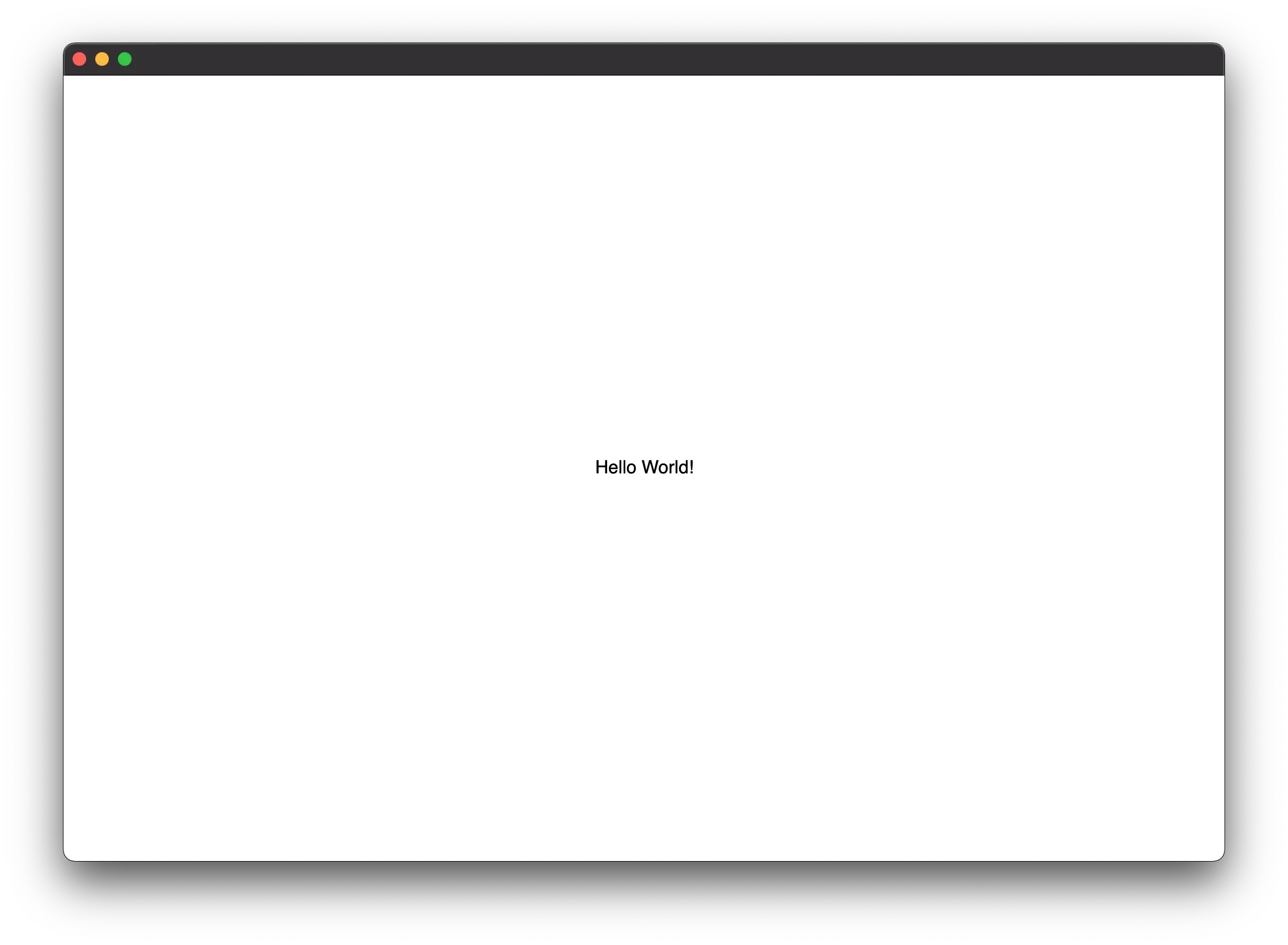
Implementation
use gpui::{
    AppContext, Application, Context, IntoElement, ParentElement, Render, Styled, Window,
    WindowOptions, div, white,
};

struct RootView;

impl Render for RootView {
    fn render(&mut self, _window: &mut Window, _cx: &mut Context<Self>) -> impl IntoElement {
        div()
            .size_full()
            .flex()
            .items_center()
            .justify_center()
            .bg(white())
            .child("Hello World!")
    }
}

fn main() {
    Application::new().run(|app| {
        app.open_window(WindowOptions::default(), |_window, app| {
            app.new(|_cx| RootView)
        })
        .unwrap();
    });
}
Counter
A number counter with an increment and decrement button.
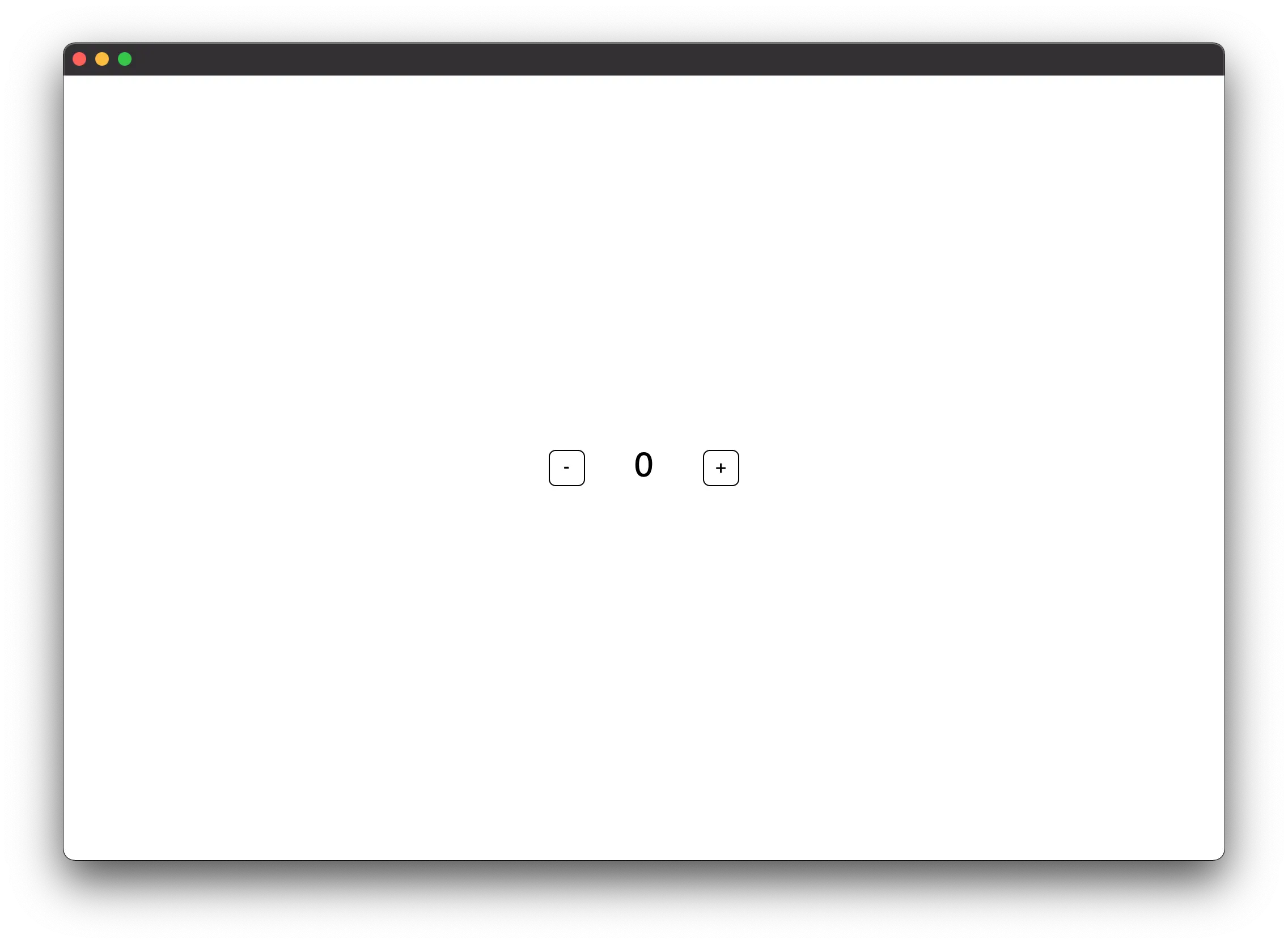
Implementation
use gpui::{
    AppContext, Application, ClickEvent, Context, InteractiveElement, IntoElement, ParentElement,
    Render, StatefulInteractiveElement, Styled, Window, WindowOptions, black, div, green, red,
    white,
};

struct RootView {
    count: isize,
}

impl Render for RootView {
    fn render(&mut self, _window: &mut Window, cx: &mut Context<Self>) -> impl IntoElement {
        div()
            .size_full()
            .flex()
            .items_center()
            .justify_center()
            .gap_5()
            .bg(white())
            .child(
                div()
                    .id("decrement_button")
                    .cursor_pointer()
                    .flex()
                    .items_center()
                    .justify_center()
                    .size_8()
                    .rounded_md()
                    .border_1()
                    .border_color(black())
                    .child("-")
                    .hover(|style| style.bg(red()))
                    .on_click(cx.listener(Self::decrement)),
            )
            .child(
                div()
                    .min_w_16()
                    .text_3xl()
                    .text_center()
                    .child(self.count.to_string()),
            )
            .child(
                div()
                    .id("increment_button")
                    .cursor_pointer()
                    .flex()
                    .items_center()
                    .justify_center()
                    .size_8()
                    .rounded_md()
                    .border_1()
                    .border_color(black())
                    .child("+")
                    .hover(|style| style.bg(green()))
                    .on_click(cx.listener(Self::increment)),
            )
    }
}

impl RootView {
    fn increment(&mut self, _event: &ClickEvent, _window: &mut Window, cx: &mut Context<Self>) {
        self.count += 1;
        cx.notify();
    }

    fn decrement(&mut self, _event: &ClickEvent, _window: &mut Window, cx: &mut Context<Self>) {
        self.count -= 1;
        cx.notify();
    }
}

fn main() {
    Application::new().run(|app| {
        app.open_window(WindowOptions::default(), |_window, app| {
            app.new(|_cx| RootView { count: 0 })
        })
        .unwrap();
    });
}
GPUI Types Glossary
This glossary contains all the types of GPUI you may encounter.